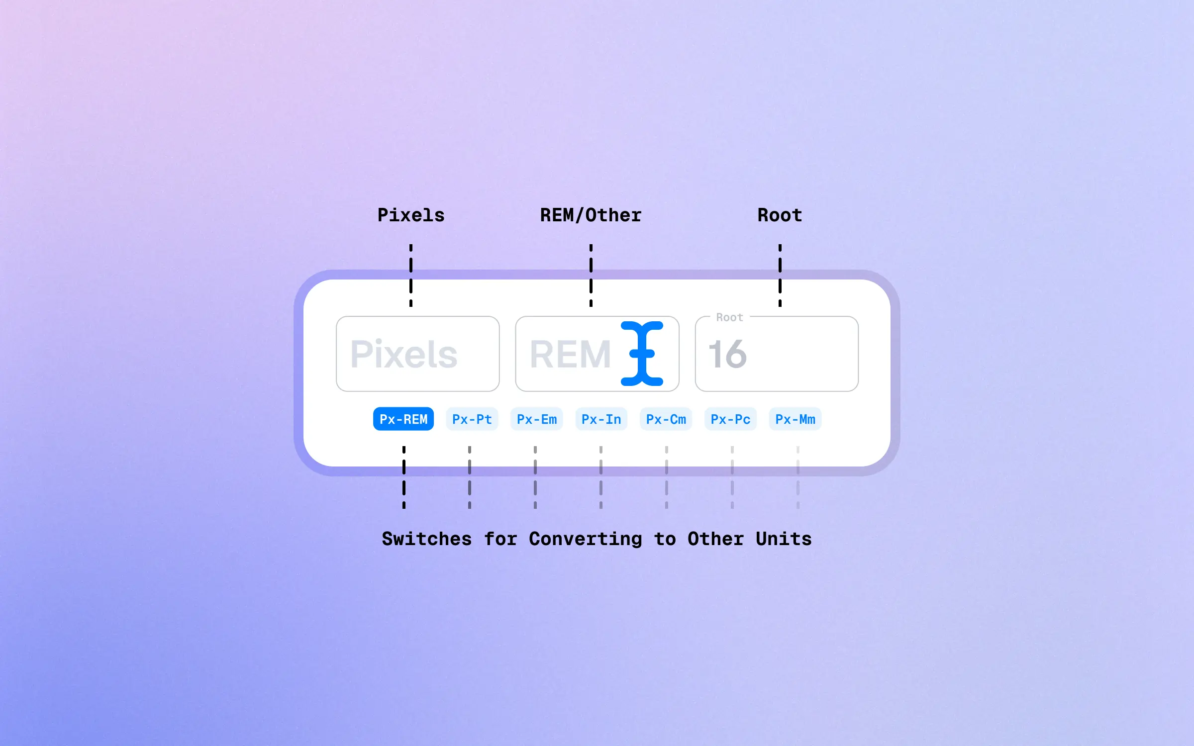
Instant PX to
Cm Converter
Instantly Convert Pixels to the
Real World Unit Cm, and Vice Versa.
Pixels
Cm
DPI (Dots Per Inch)
ā¢ā¢ā¢
How to Use Instant PX to Cm Converter
This nifty calculator instantly converts pixels to the real-world unit Cm (Centimeters).

Cool. How does it work?
The calculations are done live, as you write, and you can easily transfer the output to your clipboard by clicking the copy button.

The converter automatically assumes a 96 DPI (Dots Per Inch) standard, which is very typical in web development. However, you may change that default setting to match the size of your default DPI.

What about PX to REM or Em?
Yes, you could ...
Convert PX to Other Units
Yep, you can turn pixels (px) into points (pt), rems (rem), ems (em), or millimeters (mm), super fast.

Got it!
Pixels and Centimeters
ā¢ā¢ā¢
As you know, pixels are the fundamental digital building blocks.
A pixel, abbreviated as ‘px’, is the smallest controllable unit of a digital image or display. Pixel measurements are ubiquitous in web and digital design due to their consistency across viewing contexts.
Centimeters, on the other hand, are real-world measurements we use in everyday life. They are a unit of length in the metric system, and one centimeter is equal to one-hundredth of a meter.
In a digital context, however, a centimeter doesn’t have a fixed size in terms of pixels as it does in the physical world due to variability in screen sizes, resolutions, and pixel densities.
Converting from Px to Cm
Now let’s dive into the actual process of converting pixels to centimeters. The conversion involves the concept of DPI (Dots Per Inch) or PPI (Pixels Per Inch), which is a measure of screen resolution or pixel density.
In general, many devices, including standard computer screens, are set to 96 DPI (approximately 37.8 pixels per centimeter).
This setting is far from universal, though, with many devicesāespecially smartphones and high-definition screensāfeaturing much higher pixel densities.
To convert pixels to centimeters, you can use the formula:
centimeters = pixels / (DPI / 2.54)
The ‘2.54’ in the formula is the number of centimeters in an inch. Suppose we have a 500px image on a standard screen. Using the formula, we get:
centimeters = 500px / (96 / 2.54) ā 13.23cm
Note that this conversion is for on-screen displays. If you’re working with print, you would likely use a DPI of 300, a common print resolution.
Keep in mind that because the DPI can vary widely between different devices, the physical size represented by a specific pixel measurement can also vary.
Why is this Conversion Relevant?
While using centimeters in digital design might seem unusual, it can be quite relevant in specific contexts.
For instance, if you’re designing a web page for a product that includes real-world measurements, you might want to provide a visual representation of size in a way that’s easy for users to understand.
Let’s say you’re selling fabric and want to show an image of a 50cm sample, you could use the pixels to centimeters conversion to create an image that represents the fabric size accurately on a typical screen.
And that’s just one example.
Fluidity of Design
Design is inherently fluid.
What does “Fluid” mean?
Proportional Layout. Instead of specifying fixed widths for elements, fluid design utilizes relative units such as percentages or ems. This allows elements to adjust their size based on the available space.
Flexible Images. Images are typically set to a maximum width of 100% so that they can scale proportionally as the screen size changes. This prevents images from overflowing or getting cut off on smaller screens.
Media Queries. Fluid design often incorporates media queries, which are CSS rules that allow different styles to be applied based on the characteristics of the device or viewport. Media queries enable designers to optimize the layout and appearance for specific screen sizes or orientations.
Grid Systems. Fluid designs often employ grid systems that dynamically adjust the placement and spacing of elements. Grid frameworks, such as Bootstrap or Foundation, provide responsive grid systems that help in creating fluid layouts.
With the multitude of devices and screen resolutions in use today, it’s almost impossible to ensure that a specific pixel measurement will translate to a precise physical size on every screen!
Only dive into centimeters when you have a compelling reason related to physical dimensions.